Förderjahr 2020 / Project Call #15 / ProjektID: 5158 / Projekt: Web of AI
by Simon Ott, MSc
Having meaningful metrics is crucial in every exploratory data analysis. However, sometimes it is good to get an overview of the data at hand using a more symbolic approach. For this we created a novel visualization method that we call the “AI benchmark lifecycle map”. The lifecycle map classifies benchmarks into one of four classes every year. Every class is represented as an icon, while the size of the icon represents the amount of benchmarks falling into this category. You can find this chart and many more (as interactive charts) here: https://openbiolink.github.io/ITOExplorer/.
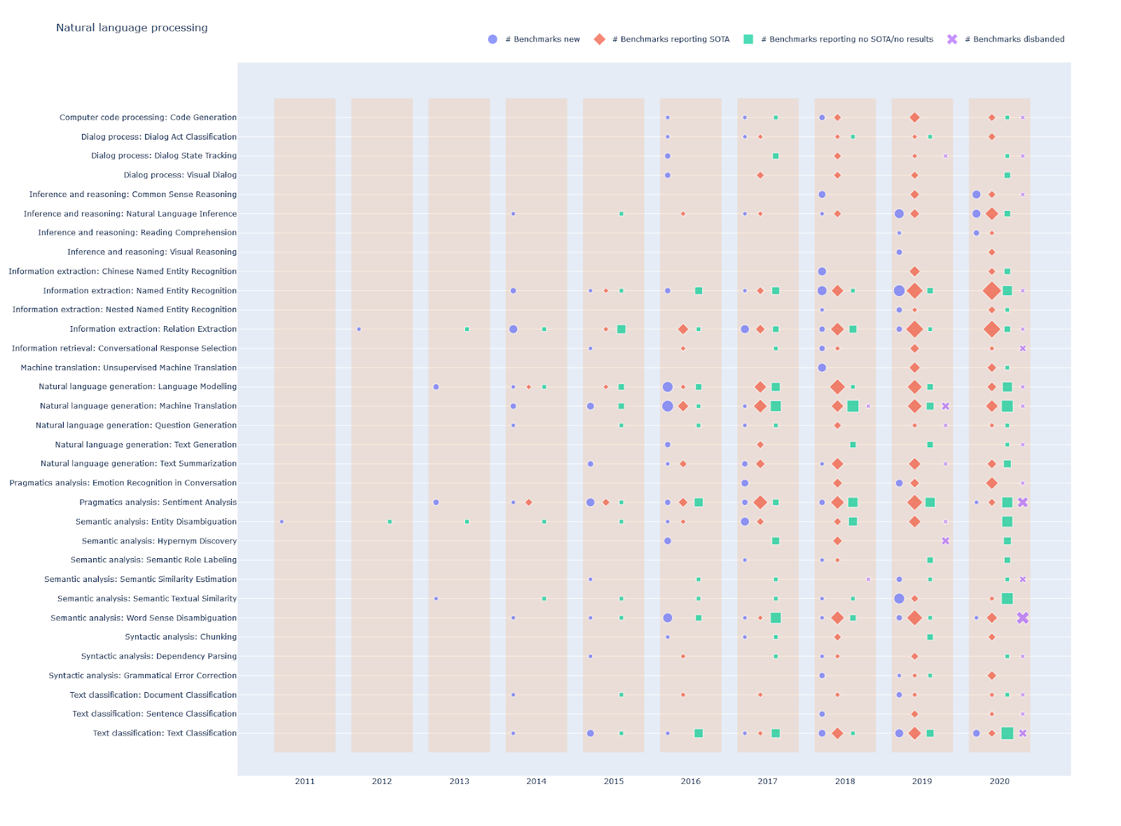
The meaning of the classes is as follows:
- # Benchmarks new: A benchmark falls into this class if it reports its first results this year (If benchmark has multiple metrics: the year any metric is first reported).
- # Benchmarks reporting SOTA: Number of benchmarks reporting state-of-the-art results this year (If benchmark has multiple metrics: the year any metric is state-of-the-art). Note that the first results are not counted as state-of-the-art, as this would fall into the “# benchmarks new” class.
- # Benchmarks reporting no SOTA/no result: Number of benchmarks reporting no state-of-the-art result or no result at all this year. This class is calculated as the number of active benchmarks (cumulative sum of new shifted by a year subtracted by disbanded) subtracted by the number of SOTA benchmarks.
- # Benchmarks disbanded: Number of benchmarks reporting no further results from this year on (If benchmark has multiple metrics: the last year any metric was reported).
Note that a benchmark can only fall into a single category each year.
Filtering
To get a clean chart we filtered the data. We removed all benchmarks that have fewer than 3 reported results in at least one metric. For example, a benchmark was
- kept if it had 4 results in precision and 1 in recall
- removed if it had 2 results in precision and 2 in recall
Furthermore we filtered tasks consisting of only a single benchmark.
Outlook
The lifecycle map is one of several novel visualization and mapping tools that build on the core development of the Web of AI netidee project, the Intelligence Task Ontology and Knowledge Graph (ITO). We hope that analytical methods like the one presented here help to better understand the development and application of AI in the future.